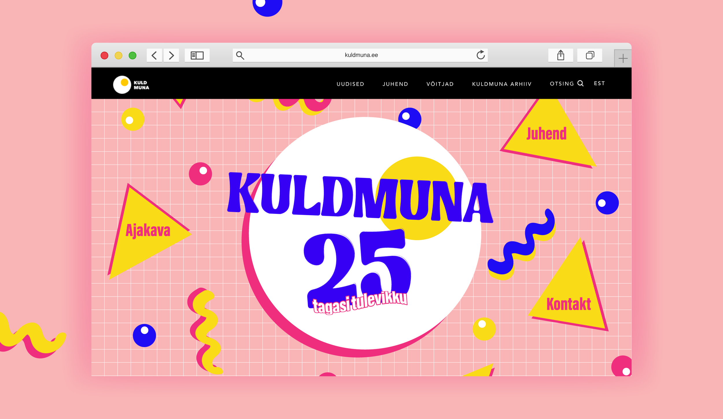
The 25th anniversary of Kuldmuna award show leans back and reminisces about the last 25 years. For some, 1997 seems like a lifetime ago, to others it might as well been last week. But what is consistent, is the rate of progression of Kuldmuna, leaving its adolescence behind and getting comfortable with its own maturity.
creative direction; art direction; design; copy

A soft-throwback to the late 90s design, which uses a lot of basic geometric shapes.
This visual identity harnesses a form of duality, where it’s a mix of 90s design features with contemporary elements. Since both 1997 and 2023 have common ground regarding their stylistic choices, it made sense to fuse these two eras together. The main argument for this hybrid-like approach is to visualize past, present and future all in one identity.
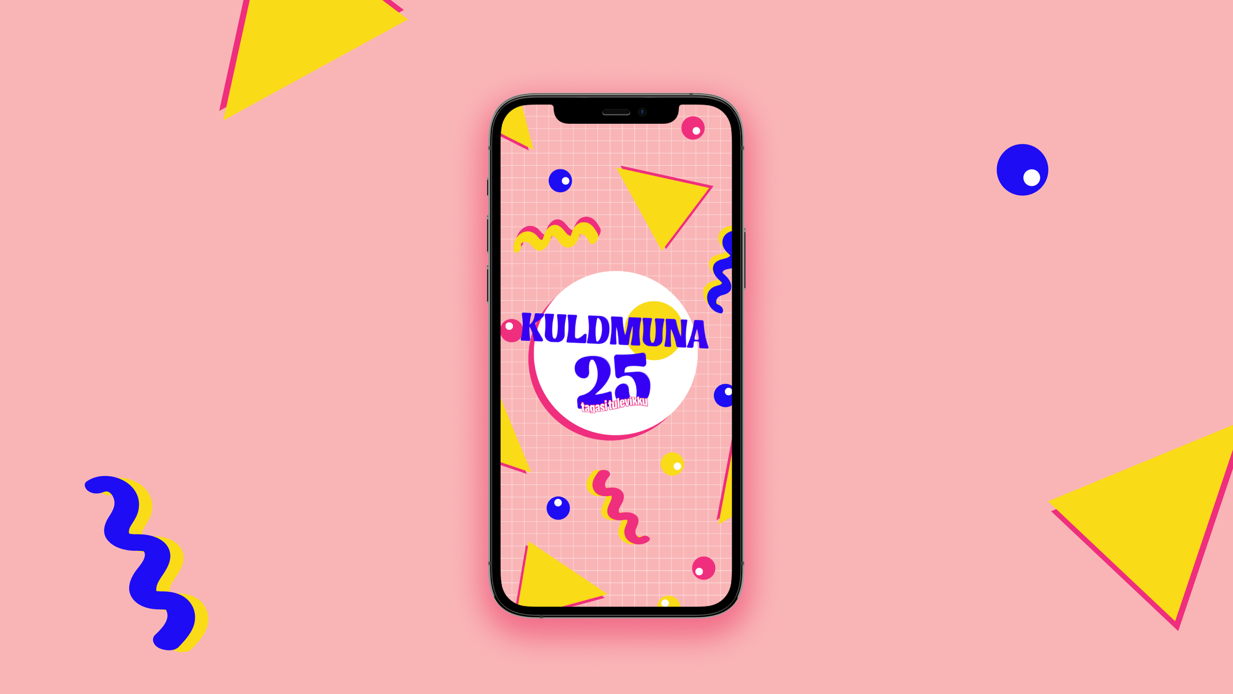
The assortment of these shapes allow them to be placed in any composition.